Brand Identity
Your first step to a pleasant morning.
I designed a complete brand identity guide for a new local coffee shop, Biscotti. For this project, I carried out the design process from logo ideation through HI-FI wireframe development.
Scroll to see my process for this project or jump to final artifacts using the links below!
Process
-
Comparative research I conducted to spark inspiration for logo design.
-
I converted ideas into physical lo-fi mockups of the Biscotti logo.
-
I identified a color palette to fit the look of the brand.
-
I developed complimentary typography for the brand.
-
I tested logos in different configurations, sizes, and defined uniform safe area.
-
I created HI-FI mockups that demonstrate the look and feel of the Biscotti app.
Client
Biscotti
Biscotti is a new local coffee shop in Ann Arbor that offers an array of biscotti and exquisite coffee.
Duration
Two weeks
Role and Responsibilities
Creative Director
Problem
The client wanted their brand to convey “a pleasant morning” whenever customers visited. They desired an elegant and classic look that made customers feel welcomed and have an energetic start to their day with Biscotti coffee and pastries. Deliverables include a new logo and hi-fi wireframes of a potential app.
Research
I researched similar local coffee shops and studied their marks for inspiration. These different logo styles helped me to think creatively about the identity of Biscotti.

Cafe Grumpy

Comet Coffee

Frenchy Coffee

Maman Bakery

Rose Wolf Coffee
Sketching
Based on the client’s needs of creating a welcoming identity and inspired by the logos I discovered in my research, I developed some sketches of the new Biscotti logo. In my ideation, I wanted to create a variety of concepts where I tested more playful themes like in A and C mixed with some more traditional type-based designs in B, D, and E.

A: "Smiling face" with coffee cup eyes and a biscotti shape forming the mouth with "Biscotti" text inside shape

B: Coffee cup on saucer with arched "Biscotti" text intersecting with steam from coffee cup to form the "i" in "Biscotti"
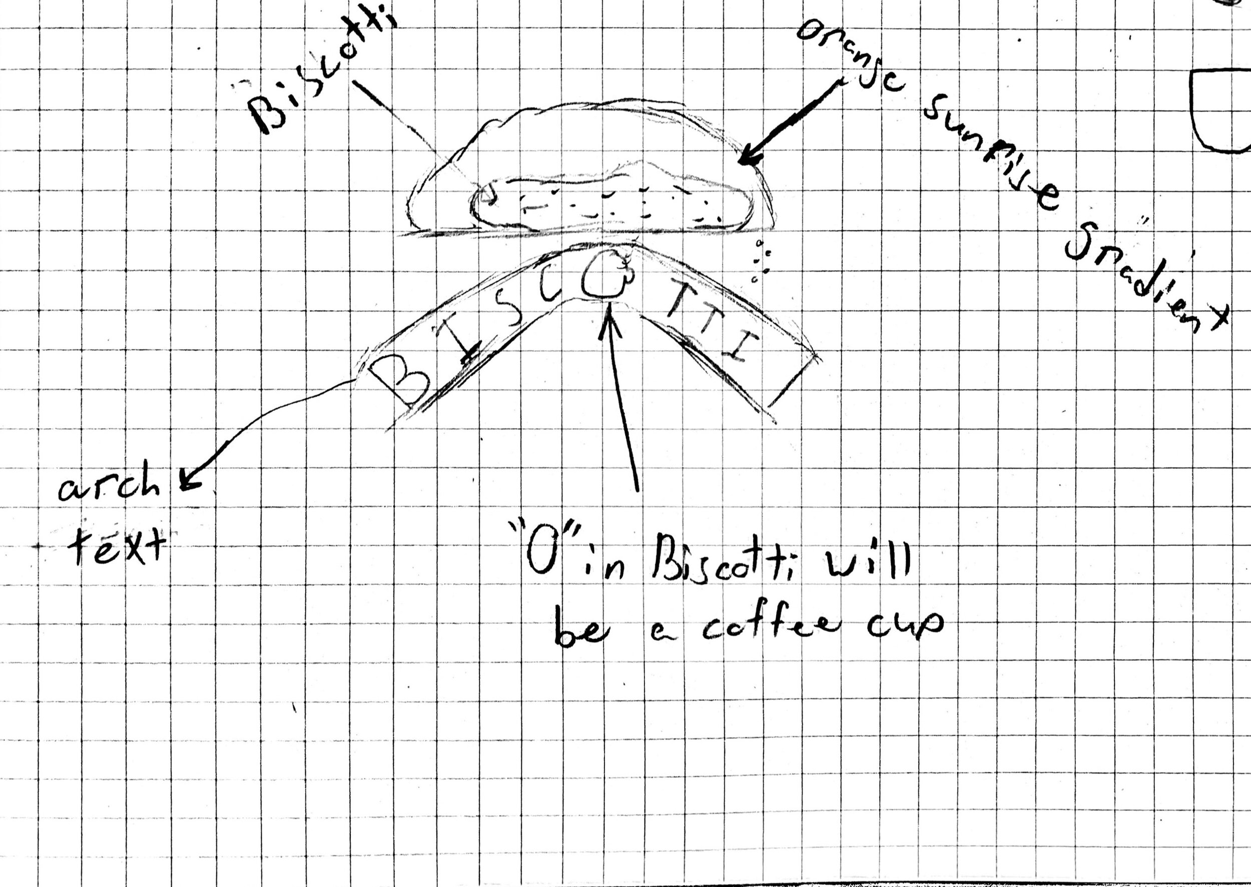
C: Sunrise within the Biscotti shape with arched "Biscotti" text sitting below; "o" in biscotti is a coffee cup
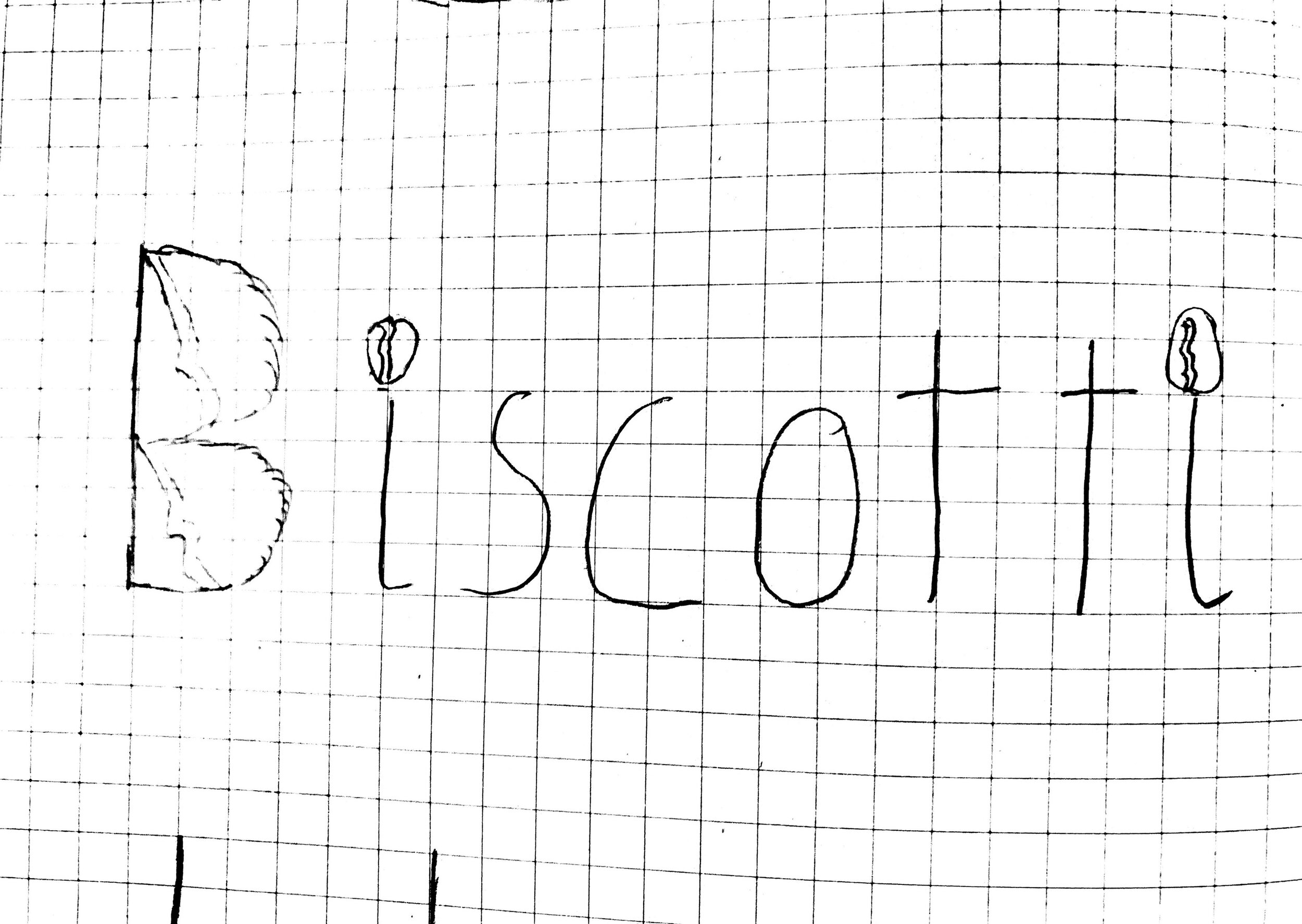
D: "Biscotti" text with coffee beans making up the "B" and on top of the "i's"
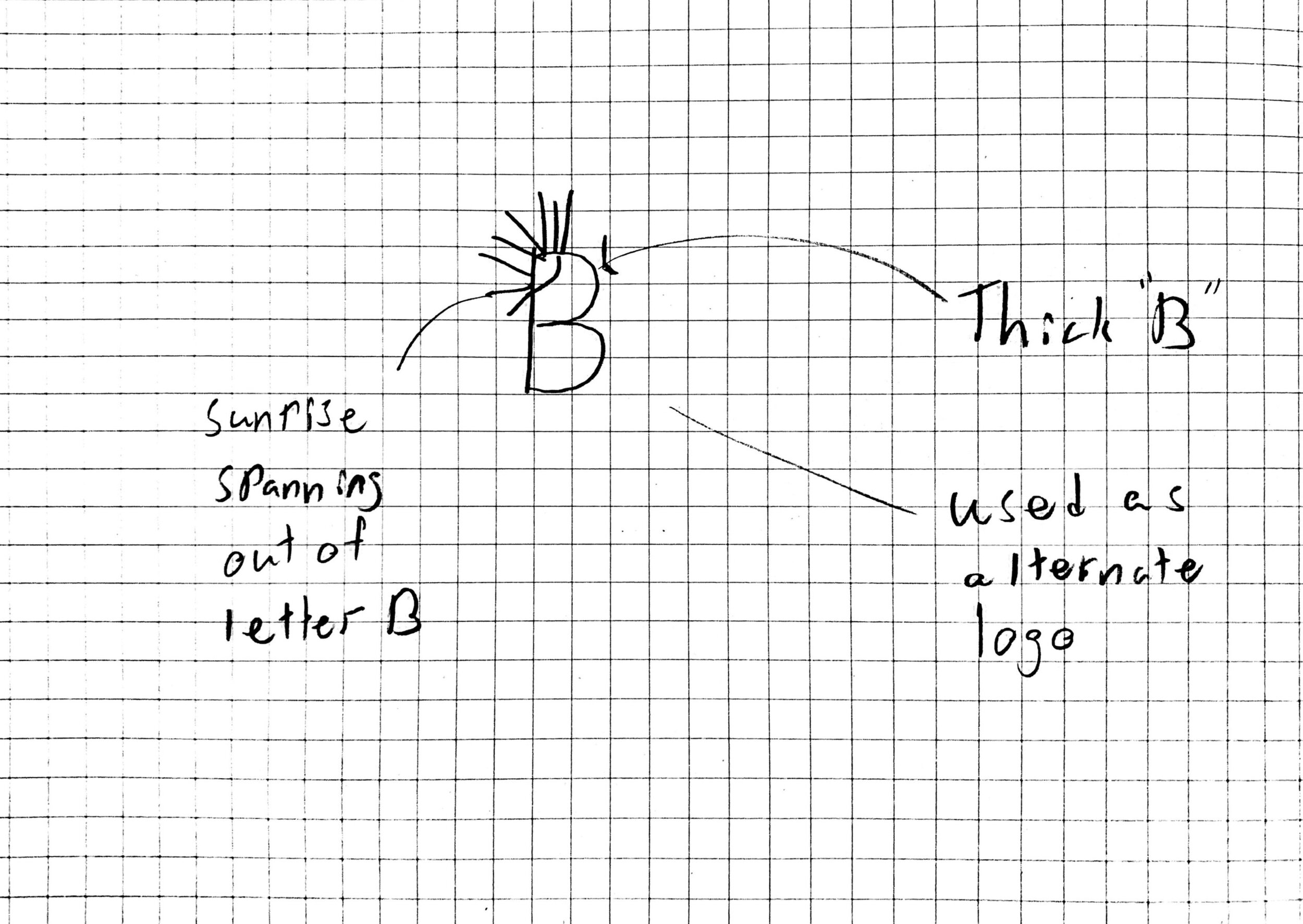
E: Bold "B" with a sunrise in the top left corner
HI-FI Sketches
After receiving feedback on my initial sketches, I narrowed my ideas down to two versions and created hi-fi mockups in Adobe Illustrator. This first round feedback made me think about reducing my ideas to only include two primary visual elements (the sunrise and biscotti shape) to convey elegance and simplicity.

Concept A: Arched “Biscotti” text within biscotti shape that doubles as a sunrise

Concept B: Sunset stacked on top of Biscotti text and biscotti shape
Final Sketch
After receiving more feedback on the two concepts, I arrived at my final concept for the Biscotti logo.
This logo is inspired by the comfort that comes along with enjoying an early morning or afternoon pitstop at Biscotti. The arched text is inspired by a morning stretch where the text is stretching instead of physical arms. Also, embedded within the “o” in “Biscotti” is a coffee pot that informs perspective customers of exactly what sort of products are sold at Biscotti. The trend of early-morning is also shown by the outline of the biscotti shape that simultaneously represents a rising sun.This shape makes use of the closure Gestalt principle where while only the top portion of the sun is visible, the viewer can complete the full circle despite it not being in view.

Arched “Bicotti” text featuring a half-full coffee pot in the “o” over a simplified biscotti shape. The tagline “what’s more delicious?” is located underneath it.
Color palette definition
The warm blend of the rich, scarlet red with shades of yellow-ish gold is meant to reflect warmth, enthusiasm, and energy; all feelings that suggest a strong start to the day. The dark brown was used to symbolize coffee in the pot.
The secondary palette is featured in later hi-fi wireframes.

Typography
The clean and sharp typeface choice is meant to speak toward the playful and elegant nature of Biscotti.

Logo variations, scalability, and safe area definition
This collection samples different variations of logos that can all be used in different scenarios - on napkins, physical walls, tables, stickers etc.
I’ve also included grayscale and black & white versions of the logo along with scalability.


Design Guide


Wireframing: Lo-fi
I continued the development of Biscotti by designing their app. In this project I applied the branding I defined in the design guide to a physical product.


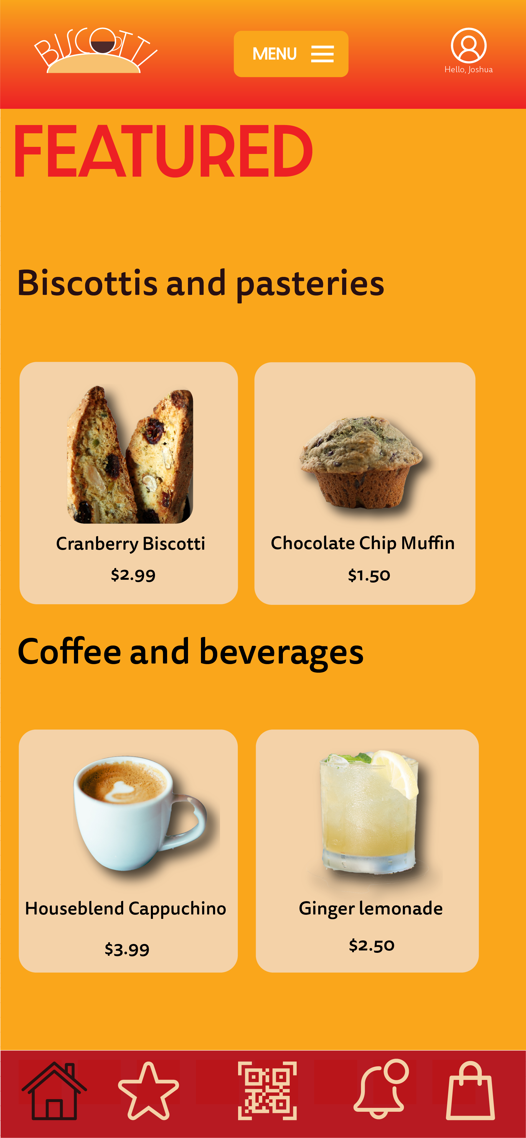
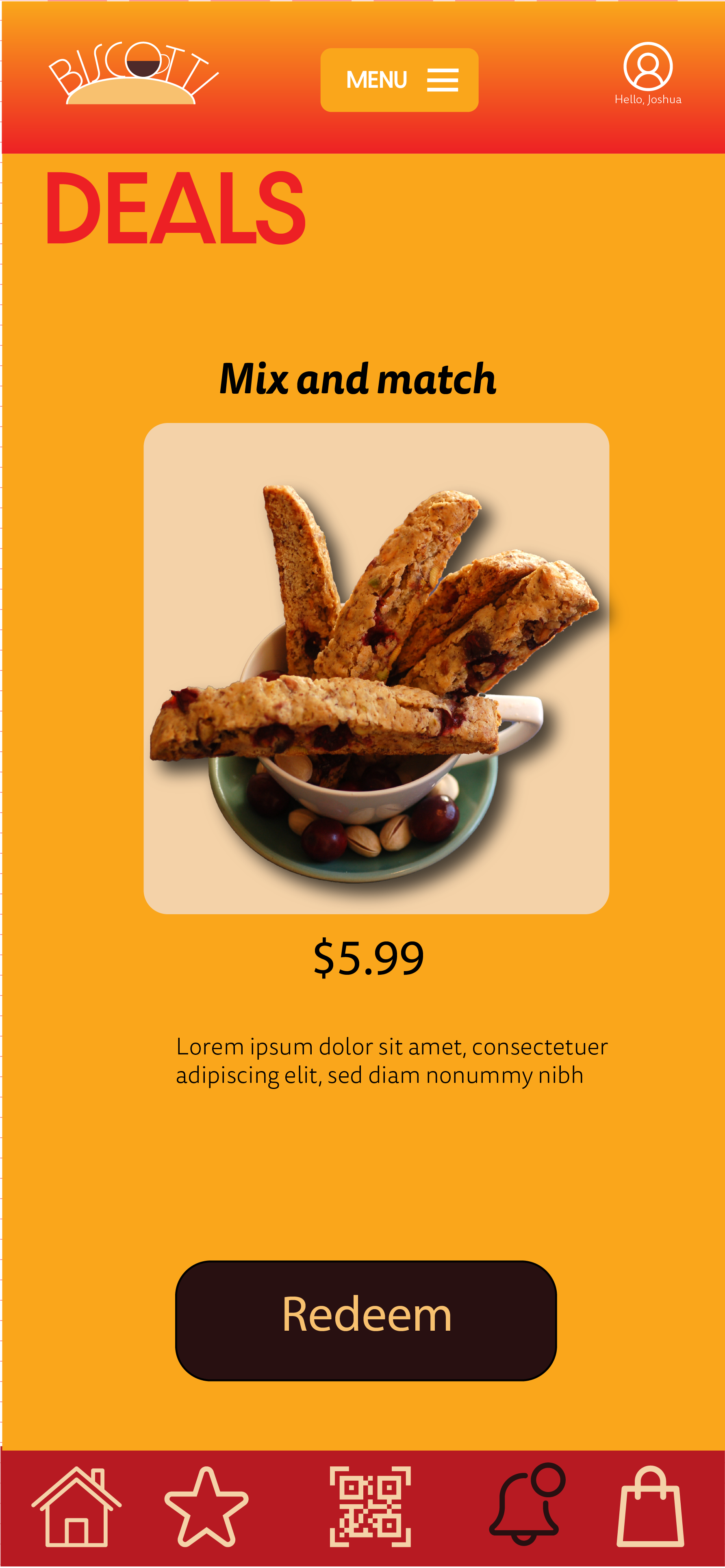
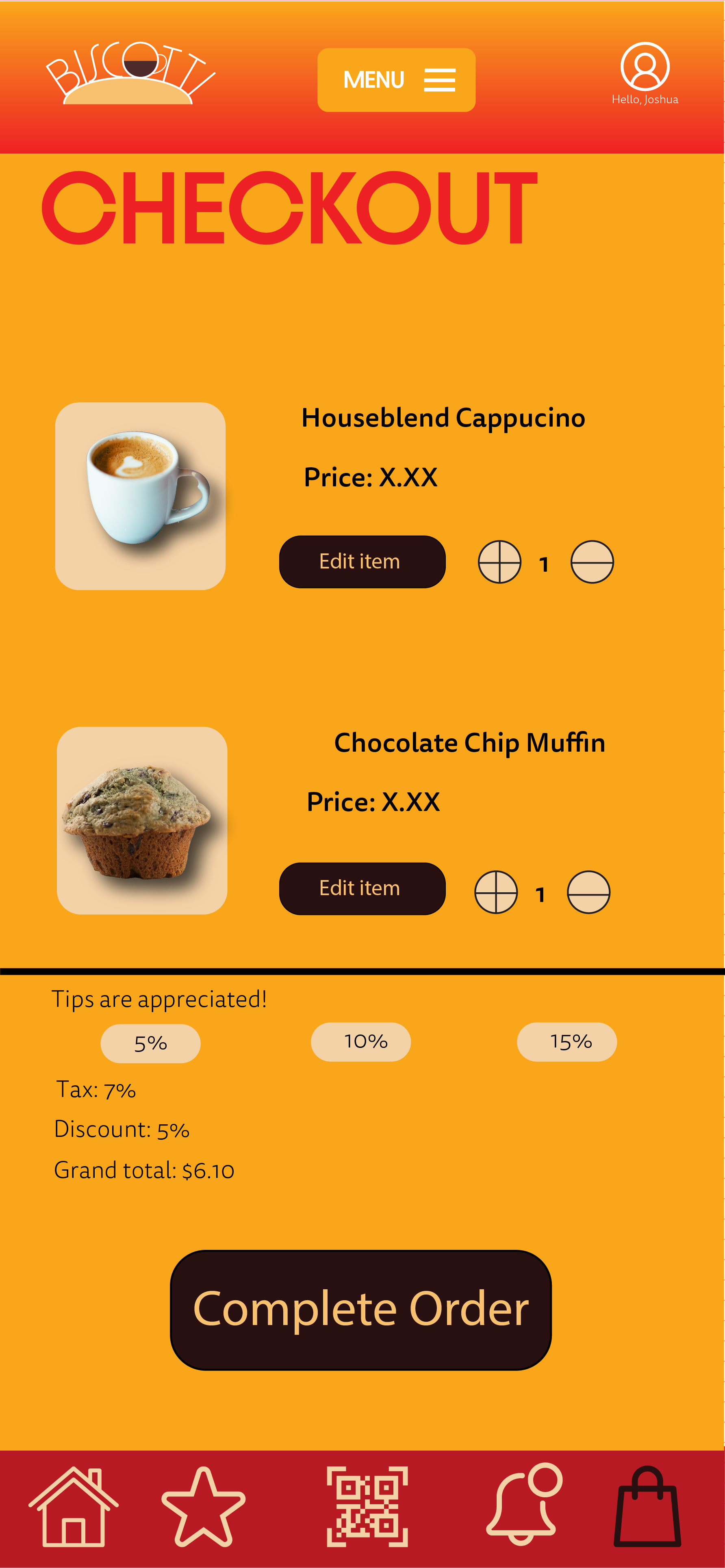
Wireframing: Hi-fi
These mockups are meant to be an extension of the Biscotti brand I defined earlier in this process. The gradient and warm color scheme are meant to symbolize comfort complemented with an energetic blend of red and orange.
These are a few of the main screens of the Biscotti app that are meant to showcase the look and feel of what this app can look like. The minimalistic design is meant to maximize efficiency when customers are browsing their items as they’re able to scan large, bold text, swipe through item cards, and view products with few clicks.